Becoming Dutch III
Summary
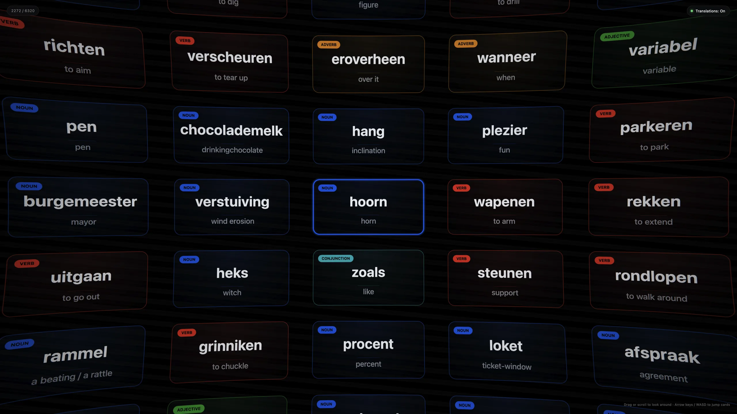
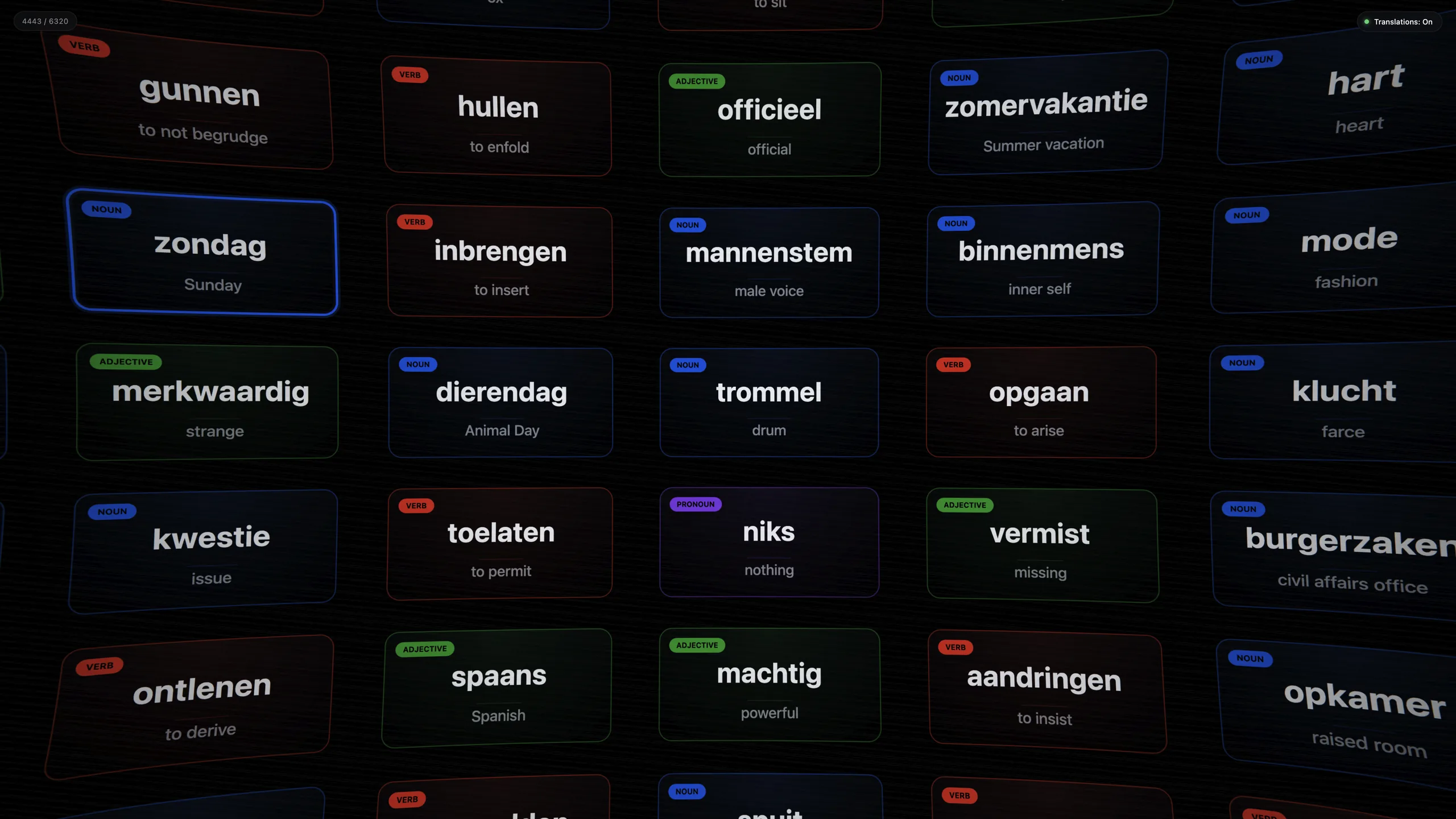
Becoming Dutch III turns 6,320 Dutch A1/A2 words into an infinite, draggable wall of flashcards seen through a fisheye lens. Cards are colour-coded by part of speech, snap to a grid when you let go, and respond to mouse, trackpad, keyboard, touch or a game controller. I directed Claude Code through many rounds of design, debugging and data work. There was no UI kit, no framework and no design file to start from.
- Role
- Product, design direction and QA, with AI pair-programmed implementation
- Stack
- Vanilla JavaScript, Three.js (WebGL), custom GLSL shader, Canvas 2D, Gamepad API, plain CSS. Nothing to install and no build step.
- Highlights
- Infinite 3D wall, custom lens shader, constant-cost rendering, 6,320-word dataset with inferred parts of speech
Context & Challenge
Flashcard apps show one card at a time, so you never feel how big a language is. I wanted to make the scale of a vocabulary tangible and to reward wandering. Instead of a “next” button, you get a wall of thousands of words in every direction that you browse like a map.
A translation toggle hides the English and turns the wall into a self-test.
My Role & Responsibilities
As product owner and design director, I:
- Set the taste and the constraints: “no framework”, “cards must never repeat on screen”, “it should feel like looking through a lens”
- Tested every change in a real browser: console clean, behaviour exercised, screenshots compared
- Found the root cause of each hard bug and fixed it at the source
- Defined the visual language: eight part-of-speech colours that carry meaning and style at once
Approach
1. Rebuilding the model
Version one placed cards on the inside of a sphere with an orbiting camera. It looked impressive in a screenshot and felt wrong in the hand: rows and columns never lined up, and the lens effect changed with where you looked. The rebuild inverted the idea. The camera never moves, and an infinite flat grid slides past it. The lens became a pure function of screen position and every cell got uniform spacing. Recognising that the best-looking visual and the right model were different things is the part of this project I’m proudest of.
2. Constant-cost rendering
A fixed pool of 169 meshes (a 13×13 window) is reassigned to the grid cells nearest the view, and modular indices make the wall wrap in both directions. Card faces are drawn on demand with Canvas 2D and uploaded as textures. Cost stays the same however large the dictionary grows.
3. A lens you can click through
The scene renders through a custom GLSL pass with barrel distortion, radial blur, chromatic aberration, vignette and film grain. Because the lens bends what you see, clicks are mapped through the same distortion before raycasting, so tapping a curved card selects that card. Drag, scroll, keys, touch and gamepad all feed one shared view state, so they compose: grab the wall mid-glide and it stops under your finger.
4. Colour as the design system
With no component library, Figma file or tokens, the eight part-of-speech colours became the whole visual language, reused for card borders, glows and labels. Little else is on screen, so depth, blur and vignette carry the designed feel. The system was discovered by looking at the running app and refining it.
5. Building the data
The dictionary grew from 5,468 NT2Lex words to 6,320 after I added 856 new words from two A1 and A2 vocabulary exports. The source had no part of speech, so I inferred it from reverse-engineered category icons, translation hints, closed-class word lists and suffix rules, then reviewed each bucket by hand. That review caught real misfires: nouns tagged as adjectives (kameel, gymzaal), a verb tagged as a noun (omvatten) and a missed conjunction (ofschoon).
Problems Solved
Missing cards at the grid seam
6,324 words did not divide evenly into a grid, so leftover cells repeated words, and the render pool tracked cards by word instead of by cell. When both copies were on screen, one lost its mesh. I removed four redundant entries (duplicate conjugated verb forms) so the count factors exactly into an 80×79 grid. No padding, no duplicates, and the bug can no longer happen anywhere.
Scrolling that felt dead
The wheel handler was firing correctly. Its sensitivity was tuned so low that real scroll input barely registered. One constant fixed it, and a cap on per-event movement stops a hard trackpad flick from teleporting across the dictionary.
What I Learned
- The right model beats the cool-looking one. Moving from a sphere to a sliding grid simplified everything downstream.
- Constant-cost rendering is a design decision. A dictionary ten times larger would run the same.
- A data bug is a product bug. Fixing the word count was cleaner than patching the renderer.
What’s Next
- Click-to-hear pronunciation with the Web Speech API
- Spaced-repetition mode: mark words as known and fade them out
- Filters by part of speech or CEFR level
- Mobile polish: pinch-to-zoom and haptic snap feedback
Credits
Base vocabulary derived from NT2Lex (Tack, François, Desmet & Fairon, 2018; CC BY-NC-SA 4.0), with English glosses cross-referenced from Dutch Wiktionary (CC BY-SA). Additional A1/A2 vocabulary from a startdutch.app export. 3D rendering by Three.js (MIT).