Moa Health and Fitness App
Summary
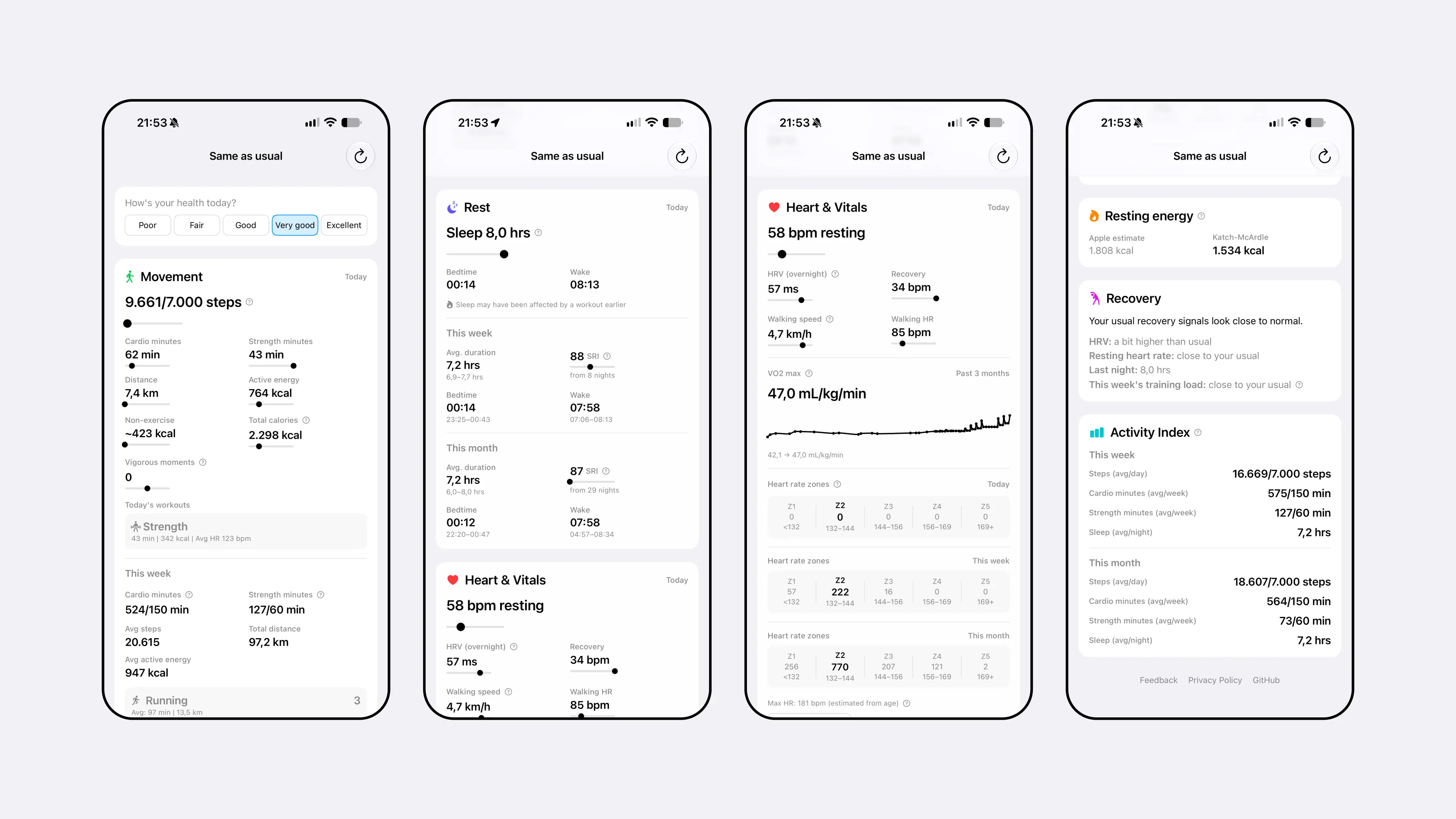
Moa is an iOS app I designed and built solo, turning the Apple Health and HealthKit data most people already generate but never look at into something legible. Instead of blending steps, sleep, heart rate and recovery into a single score, every metric is shown on its own, next to the research it's based on. Built entirely on device with no accounts, no backend and no analytics, then shipped open source under the MIT license.
- Role
- Solo Designer & Developer
- Scope
- iOS app design and development, HealthKit integration, privacy-first architecture, open source release
- Highlights
- No-blended-score design philosophy, research-grounded metrics, 100% on-device, Claude Code as full-time pairing partner, MIT-licensed release

Context & Challenge
Apple Health already collects almost everything about how you move, sleep and recover: steps, heart rate variability, VO₂ max, sleep stages. Almost none of it gets looked at. It sits in Apple's own contextless charts, or it gets funneled into a third-party app that reduces all of it to a single 0 to 100 score.
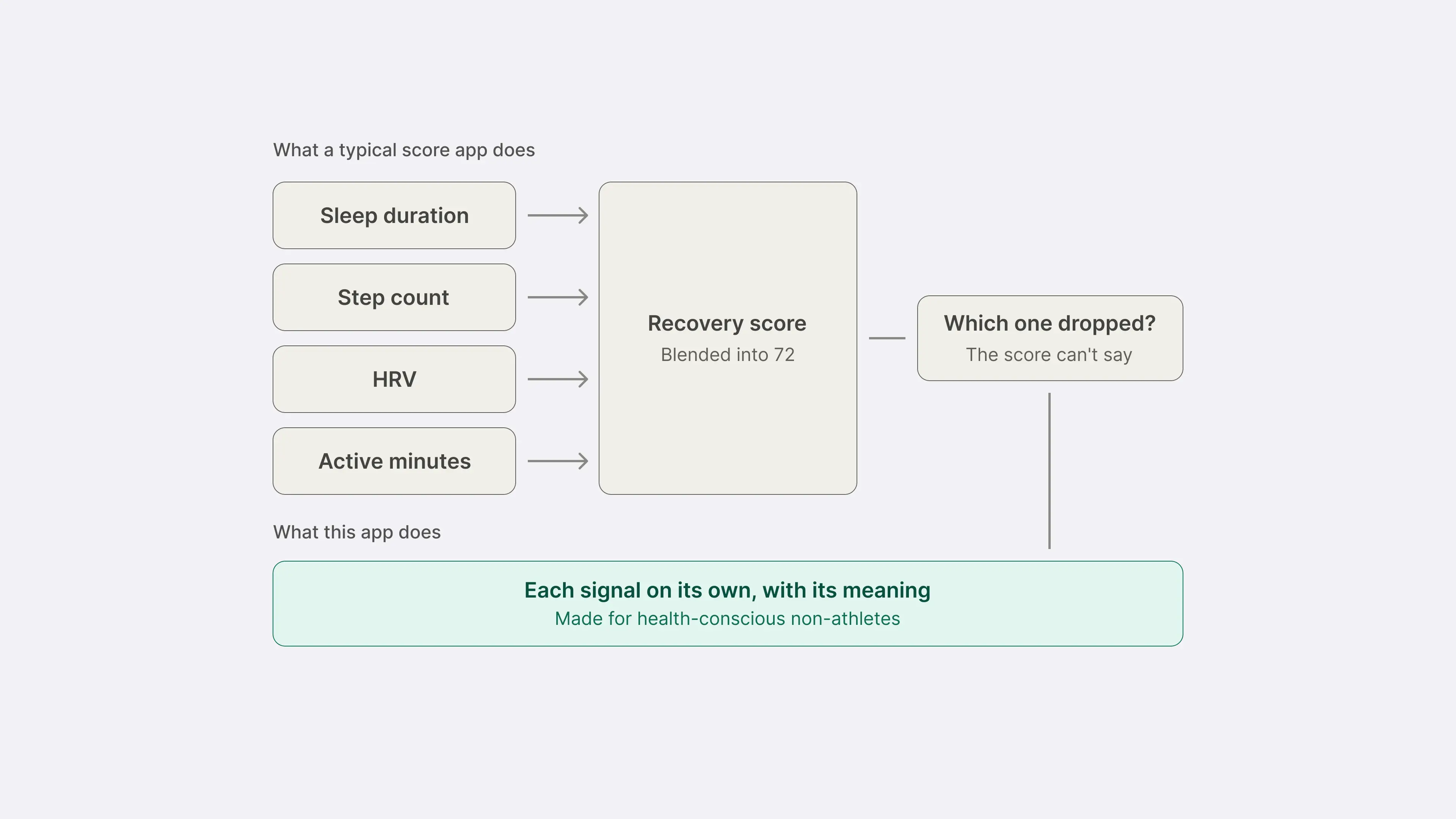
That collapsing is the problem. A recovery score of 72 doesn't say whether it was last night's short sleep or this week's low step count that pulled the number down, and a well-designed score is, by definition, designed to stop you asking.
The challenge was to design for the audience between two extremes: health-conscious non-athletes and casual athletes who want to understand their own data. Gamified scores give them a verdict, and raw exports assume they already know what they're looking at.
My Role & Responsibilities
As sole designer and developer, I:
- Set the product principle the app runs on: every number shown next to what it means, nothing averaged away to make a headline figure tidier
- Designed all six dashboard sections and the metrics inside them, grounding each one in the published research behind it, including Karvonen heart rate zones, the Phillips et al. Sleep Regularity Index, and Stamatakis et al.'s work on incidental vigorous activity
- Made the key trade-off calls: cutting a blended activity score, cutting an injury-risk verdict, and keeping validated metrics on their native research scale
- Built the app with zero backend, zero accounts and zero third-party dependencies, keeping every calculation on device
- Designed every screen directly in SwiftUI against real HealthKit data, with Claude Code as a full-time pairing partner through implementation and debugging
Approach
1. Replacing the score with the numbers behind it
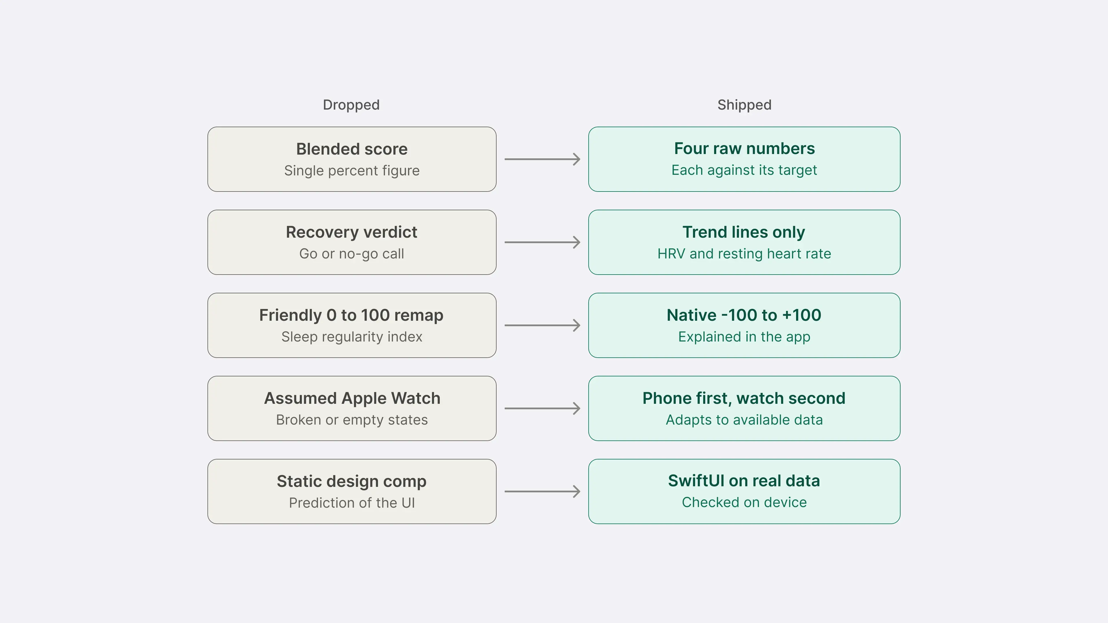
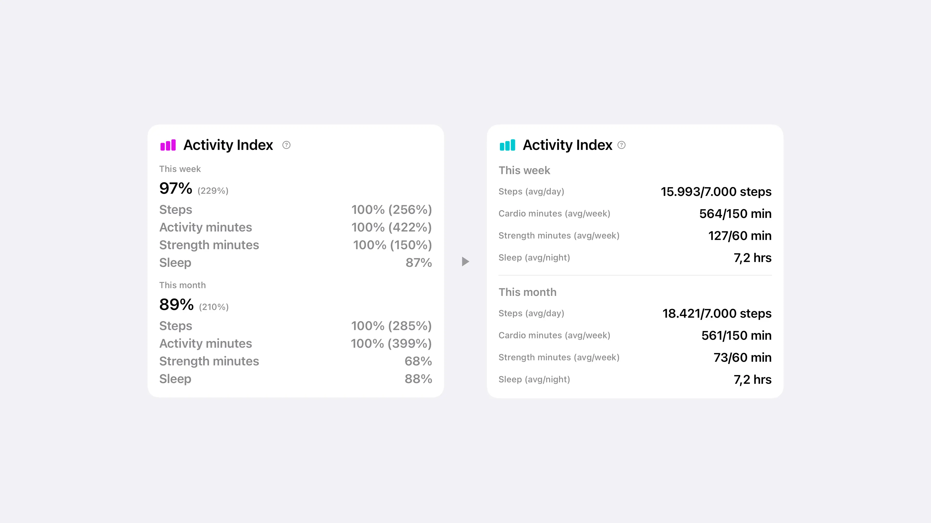
The Activity Index and Sleep Score both started as blended percentage figures. Both were reworked into four independent numbers (steps, cardio minutes, strength minutes, sleep) shown against their own targets, because a blended percentage can't tell you which of the four is actually short.
2. Leaving contested science as a trend, not a verdict
The research behind training load and injury-risk ratios is genuinely unsettled. The Recovery section shows HRV and resting heart rate as trend lines only, with no confident-sounding score on top. The cut was a principled call.
3. Keeping validated metrics on their real scale
The Sleep Regularity Index (Phillips et al., 2017) ships on its native −100 to +100 scale with an in-app explainer, matching the published research. Heart rate zones use the Karvonen method, which factors in resting heart rate. Apple's calculation uses max heart rate only. The difference matters most for an audience whose resting heart rate is more likely to vary from population norms.
4. Designing for a phone, not assuming a watch
The target audience is far less likely than a fitness enthusiast to own an Apple Watch. Every section adapts to whatever data exists (phone only, watch only, or nothing yet) and always shows a useful state.
5. Building in code instead of mocking up first
There's no Figma file behind this app. Every screen was designed directly in SwiftUI and checked against real device data, with Claude Code as the implementation partner throughout. A dedicated pre-launch review pass caught a refresh-button race condition, stale heart rate zones left on screen after a failed refresh, a day-window mismatch between two figures that should have agreed, and a Dynamic Type scaling bug in a manual input field. A static comp can't contain these state-dependent bugs because it never gets refetched or resized by the OS.
Impact
Product principles tested against pressure: the app's own stated principles were used to catch and reverse a design decision. The blended Activity Index score was built, evaluated against those principles, and replaced once it conflicted with them.
Privacy by architecture: no login, no cloud sync, no analytics or crash-reporting SDK, no third-party dependencies. Privacy is built into the structure, because no code path exists that could send data off the device.
A feature a scored app wouldn't build: VILPA surfaces vigorous but unlogged activity, a sprint for a train, a fast flight of stairs, based on Stamatakis et al.'s research. It only makes sense once the product has already committed to raw numbers over a gamified log.
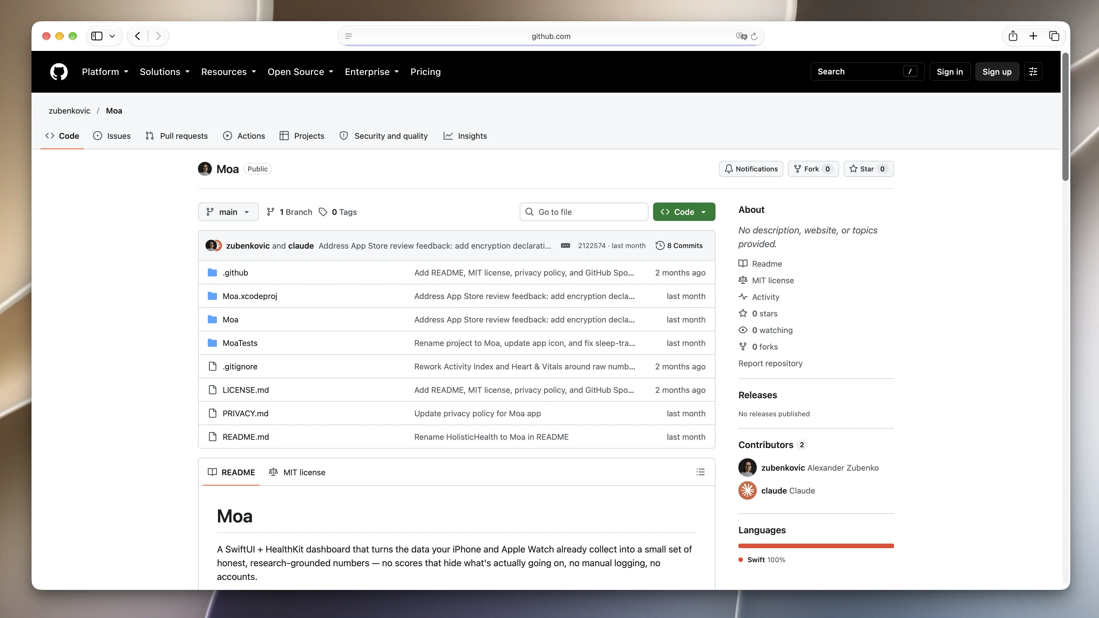
Shipped, not prototyped: complete, tested and released as open source under the MIT license, with a public README, a full privacy policy and a GitHub Sponsors page. A real, maintainable release.
What's Next
- A longer historical view (three, six, twelve months) so regularity metrics like SRI can show patterns that only emerge over time
- A watchOS complication, if it can stay glanceable without compressing everything back into a single number
- More passive-signal detection in the spirit of VILPA, surfacing value already sitting in HealthKit that a workout-centric app never looks at
- Bringing walking speed and heart rate recovery up to the same tooltip-level research grounding as the rest of the app