Better Where We Are Not
Summary
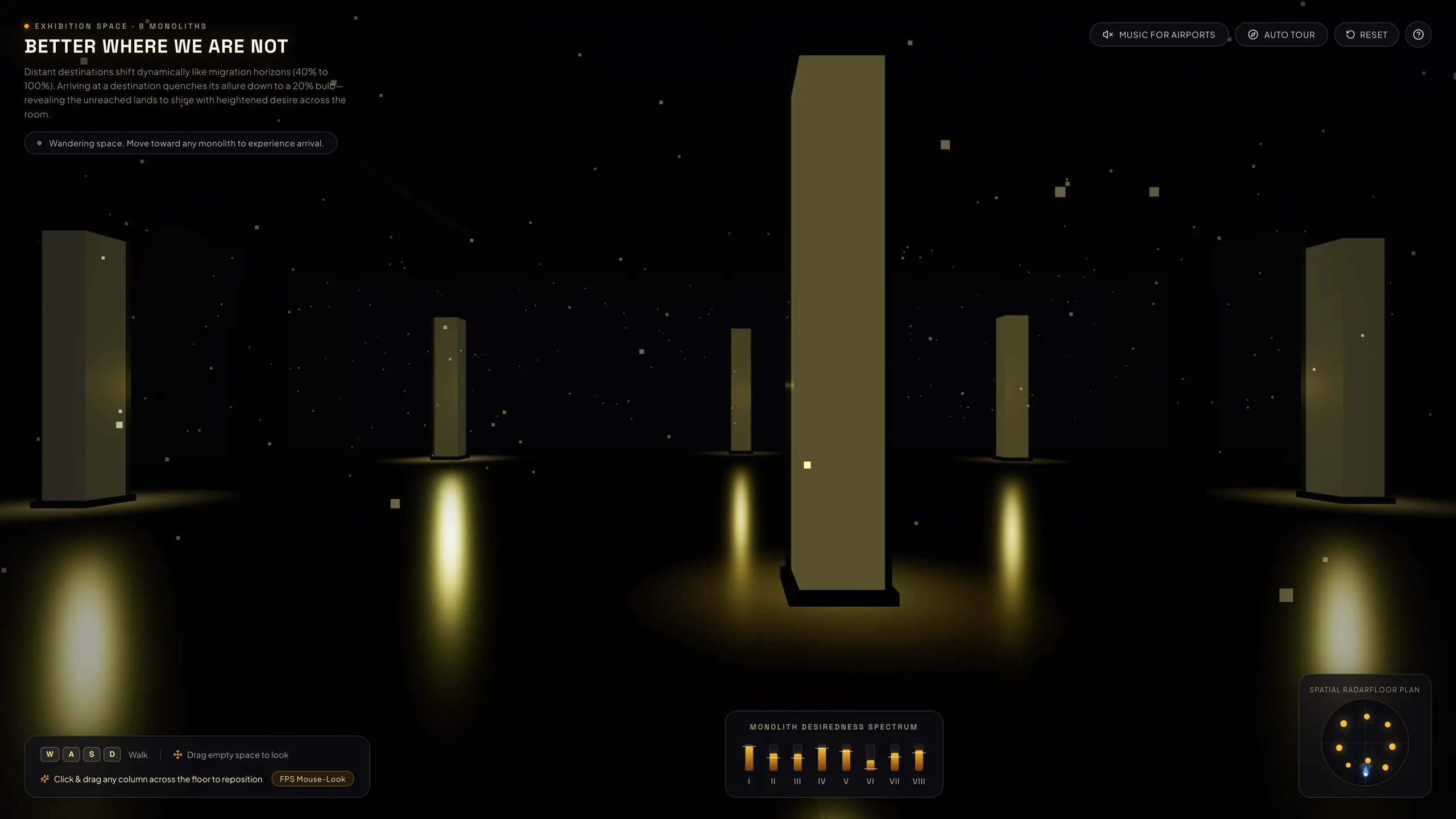
Better Where We Are Not is an interactive 3D light installation that runs in the browser. Eight monoliths stand in a dark hall, and each one is a destination. The distant ones glow with allure and drift between 40% and 100%. Walk up to one and its light fades to a 20% household bulb, while the columns you have not reached keep burning. A generative soundtrack inspired by Brian Eno’s Music for Airports fills the room. I directed Claude Code through the design, lighting, typography and sound.
- Role
- Product design, creative direction and QA, with AI pair-programmed implementation
- Stack
- React, Three.js (WebGL), TypeScript, Vite, Web Audio API. No audio files.
- Highlights
- A 20% light bulb model of arrival, a generative tape-loop soundtrack, a radar and spectrum interface
Context & Challenge
Desire works on distance. A place on the horizon looks radiant, and once we arrive and routine takes over, the glow fades. We romanticize what is far and discount what we have, whether the place is a city, a job or a life. Most digital takes on desire use points, progress bars or text. I wanted this one to live only in light, space, type and sound.
Approach
1. Perceptual contrast
Early versions took the light lost by the column you visit and added it to the distant ones. It felt like an arcade scoreboard. In real life the world does not get brighter when you arrive. The place you reached loses its luster and your footing goes dark. With the ground around you in shadow and a glossy floor underneath, the distant columns dominate your view and send golden reflections toward your feet.
2. A light bulb at 20%
My brief was one exact analogy: “a regular light bulb at 20%”. Linear colour blending drifted toward a vivid amber, which reads as intense. An incandescent curve now fades to a dull filament glow, and the light falls steeply at low brightness.
3. Migration horizons
Each monolith drifts on its own slow curve between roughly 40% and 100%, with its own speed and phase. Hotspots rise while old favourites cool, and a column you walked away from slowly recovers its allure.
4. A soundtrack from tape loops
The music is synthesized live with the Web Audio API and uses no audio files. Eight notes repeat on timers of unrelated lengths, from 17.3 to 34.2 seconds, the way Eno phased his tape loops, so they keep falling into new combinations. Arriving at a column rings a quiet chime.
Problems Solved
A dimming that looked brighter
At first a visited column looked more saturated than dim, because linear colour blending pushed low brightness toward vivid orange. An incandescent colour curve and a fixed exposure made a 20% column look dull and quiet.
Shadows that vanished
Shadows from some columns kept disappearing. The shadow range shrank whenever a light dimmed, and the frosted glass shells cast shadows from the light inside them. Every light now keeps a constant reach and changes only its brightness, and only the solid bases cast shadows.
What I Learned
- A physical analogy beats an abstract slider. “A light bulb at 20%” gave colour, brightness and opacity one clear target.
- Contrast is psychological. Darkening the ground under the visitor makes the horizon burn brighter without changing its wattage.
- Keep shadow range fixed when brightness changes, and keep a light’s own housing out of its shadows.
Credits
Concept, design direction and QA: Alexander Zubenko. Built with Three.js, React, TypeScript and Vite. Typefaces: Space Grotesk and Plus Jakarta Sans. Soundtrack inspired by Brian Eno’s Ambient 1: Music for Airports (1978).