BUX Investment Plans
Summary
BUX is an investing app from ABN AMRO. During a recruitment process I had three days to design the first web version of its Investment Plans, a recurring investing feature that already existed on mobile. I studied the product and its competitors, designed two iterations, tested them with two people and then designed a third that answers what those sessions showed.
- Role
- Product designer, solo assignment
- Scope
- User flows, desktop UI, clickable prototype, usability test, design tokens
- Highlights
- Compliance-aware layout, research-led iteration, a fixed-plan concept
- Period
- April 2026, three days
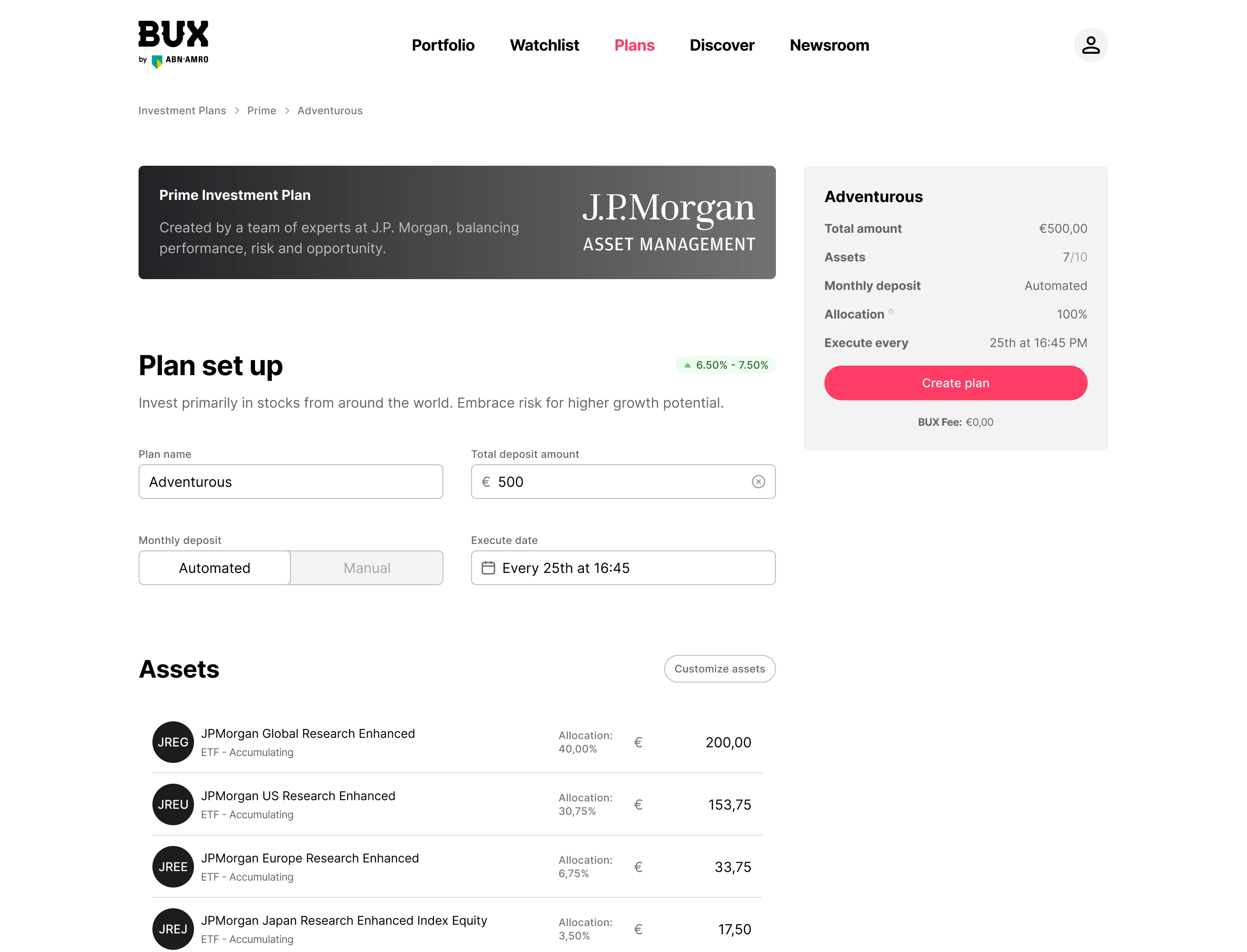
Context & Challenge
On mobile, a BUX plan invests a fixed amount on a set date every month. The brief asked for a zero-to-one web version that supports long-term use and stays consistent across platforms. In fintech the page also carries compliance: a risk disclosure, cost documents and a direct debit mandate. The challenge was to keep the same components and flow as the app, use the extra room of a desktop screen and keep every legal element in place.
Approach
1. Study how others do it
I reviewed Trading212, eToro, Scalable Capital, Degiro, Revolut and T-Bank, among others, with AI helping to cluster patterns in user feedback. Many desktop versions of mobile fintech products read as ports, with the same step-by-step flow stretched across a wide screen. I put plan setup on one scrollable page where inputs, assets, costs and the mandate are visible together.
2. Same system, different layout
I built the page from the BUX components and tokens, so inputs, list items and asset avatars match the app. Web adds a summary sidebar that stays in view, and the mobile overview screen is gone because people land directly in setup.
3. Test with the target audience
I tested with two people close to the target audience: about 35, new to investing and ready to commit if the plan made sense. Each 30-minute session combined think-aloud on the prototype with a comparison against the mobile flow.
4. Iterate on what they said
Iteration 2 added a J.P. Morgan trust banner, moved the plan name into the main content and placed the add-assets button next to the Assets heading.
What the Sessions Showed
- No reason to commit. Both people reached the mandate without a single benefit, outcome or risk explained. One said they would look it up elsewhere first.
- The asset picker is a power-user tool. Once they knew they could change assets, neither wanted to, because they did not know what to pick.
- Labels and legal copy. “ETF Accumulating” and “Monthly deposit” confused one person, and both skimmed the risk disclosure.
The pattern behind it: plans are sold as a low-effort start, yet the page only works for someone who already trusts a curated strategy without explanation.
Iteration 3
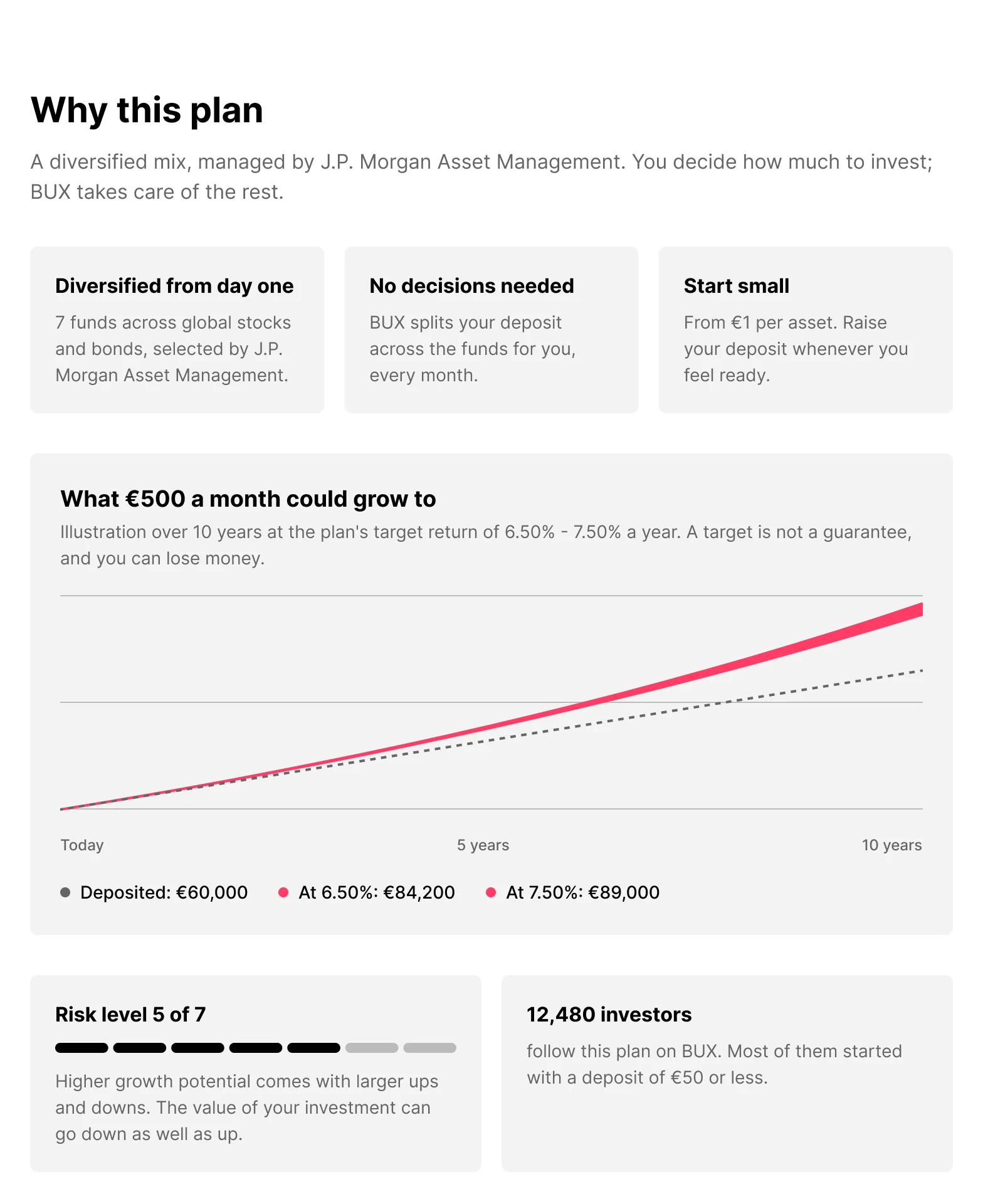
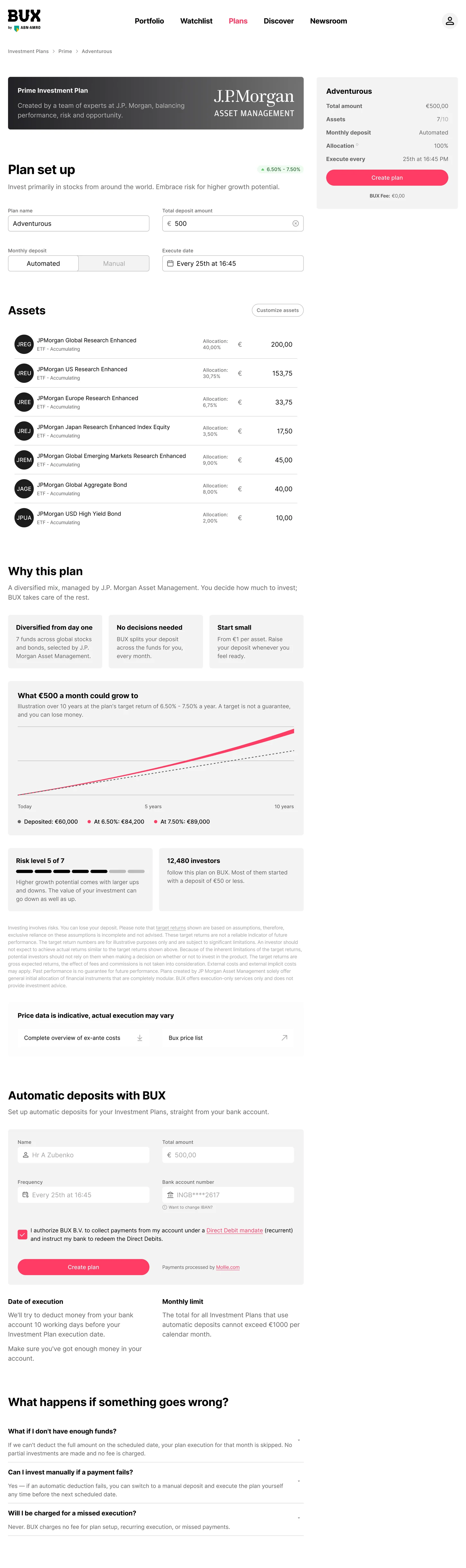
Iteration 3 acts on the biggest finding. The plan is fixed by default, which lets the page show what free editing makes impossible to calculate. A new Why this plan section sits between the assets and the legal copy, with three benefits, a ten-year projection at the target return, a risk level and the number of people who follow the plan. Amounts follow the allocation, and editing sits behind Customize assets.
The risk wording stays next to the projection, and the disclosure that target returns are not guaranteed follows right after it. Every figure arrives with its caveat. The investor count, risk level and returns in this design are illustrative and would need live data.
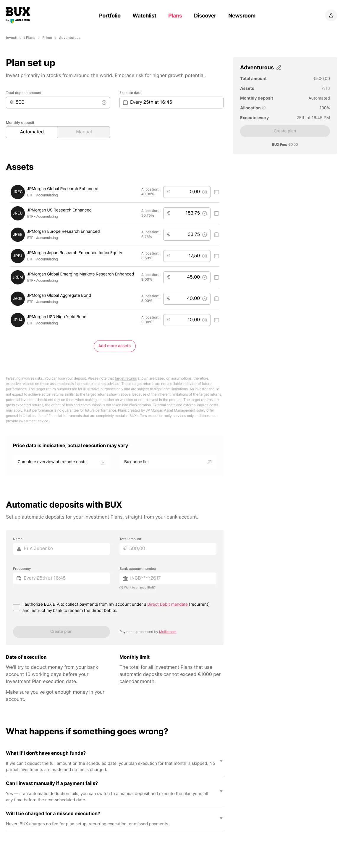
Before and After
Iteration 1 on the left, Iteration 3 on the right.
Limits & Next Steps
Two participants from my own circle is a small sample, and Iteration 3 has not been tested. Next I would run five sessions on it, then five more after the changes. The research also points to progressive commitment, starting from €1 per asset, and to a calmer plan overview on mobile.